The Search For the Next Gerber Baby
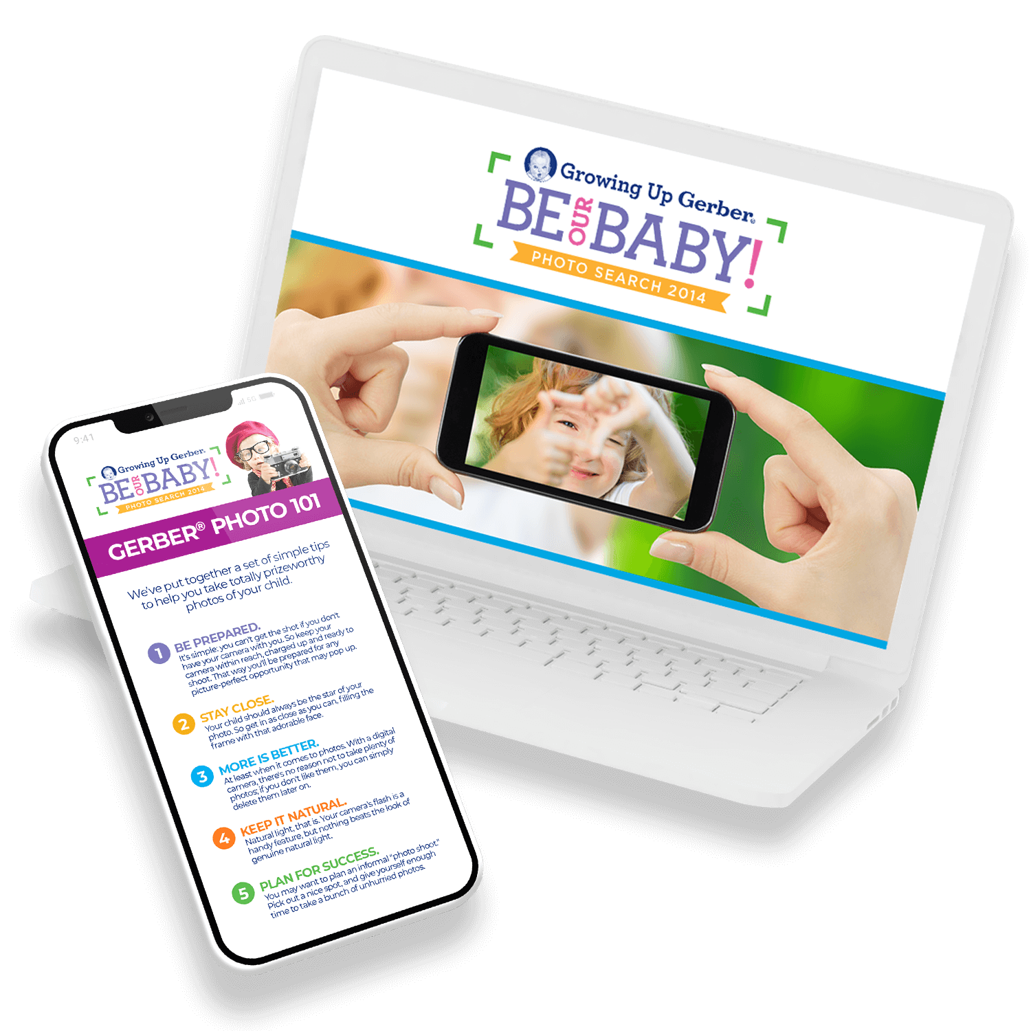
This was our second consecutive year running Gerber's Photo Search. We learned a lot from the prior year that helped inform our creative strategy moving forward. For example, all Gerber promotions had previously been hosted on Facebook. Not only did that require participants to have a Facebook account, but it also put constraints on the design of the layout. For this year, we convinced Gerber to move the Photo Search to its own separate microsite.
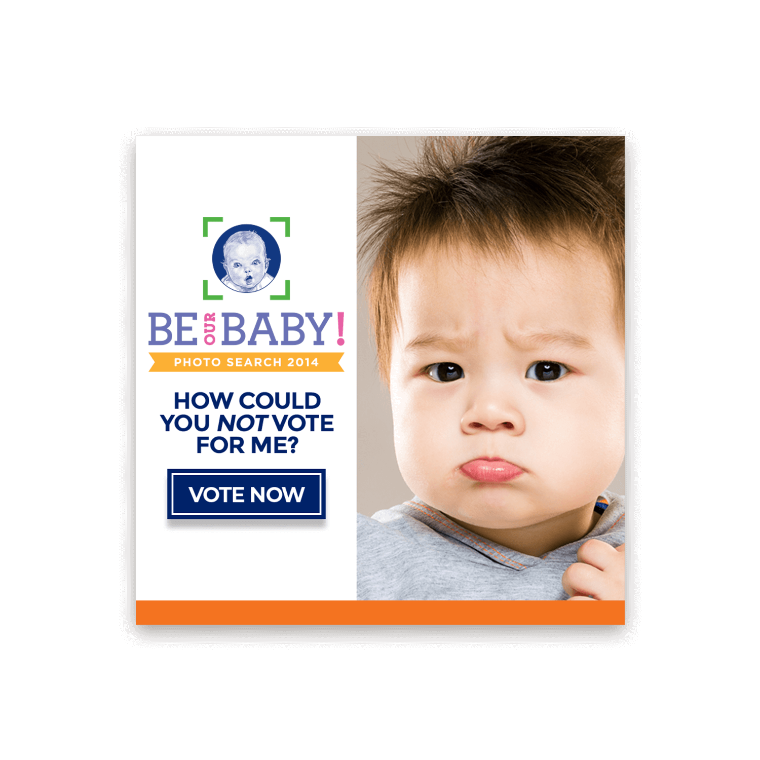
Another part of our creative strategy was to celebrate the promotion's 5-year milestone, starting with an exciting new title and succinct call to action: Be Our Baby!
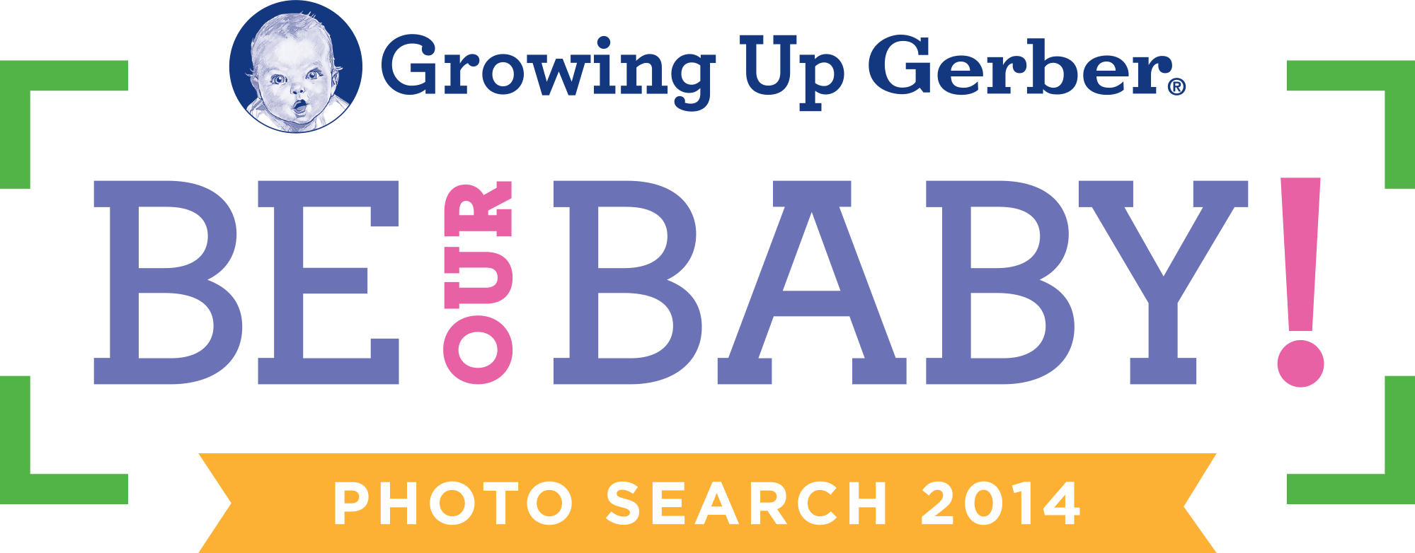
For the logo, we landed on a colorful typographic treatment contained in a graphical focus frame. Halfway through the logo development process, I was asked to include their new "Growing Up Gerber" logo. This only added more words and fonts to an already text-heavy logo. To adjust, I minimized the subordinate text and aligned it with the green corners, essentially becoming graphical elements of the focus frame and allowing "Be Our Baby!" to take center stage.

In addition to the grand prize winner, there were smaller prizes awarded to the top placing babies in each Milestone range. Gerber uses these Milestones to represent different stages of child development, each with its own unique icon and color. This provided a built-in palette of vibrant colors, adding to the excitement and celebration of the overall promotion.
Putting the pieces together
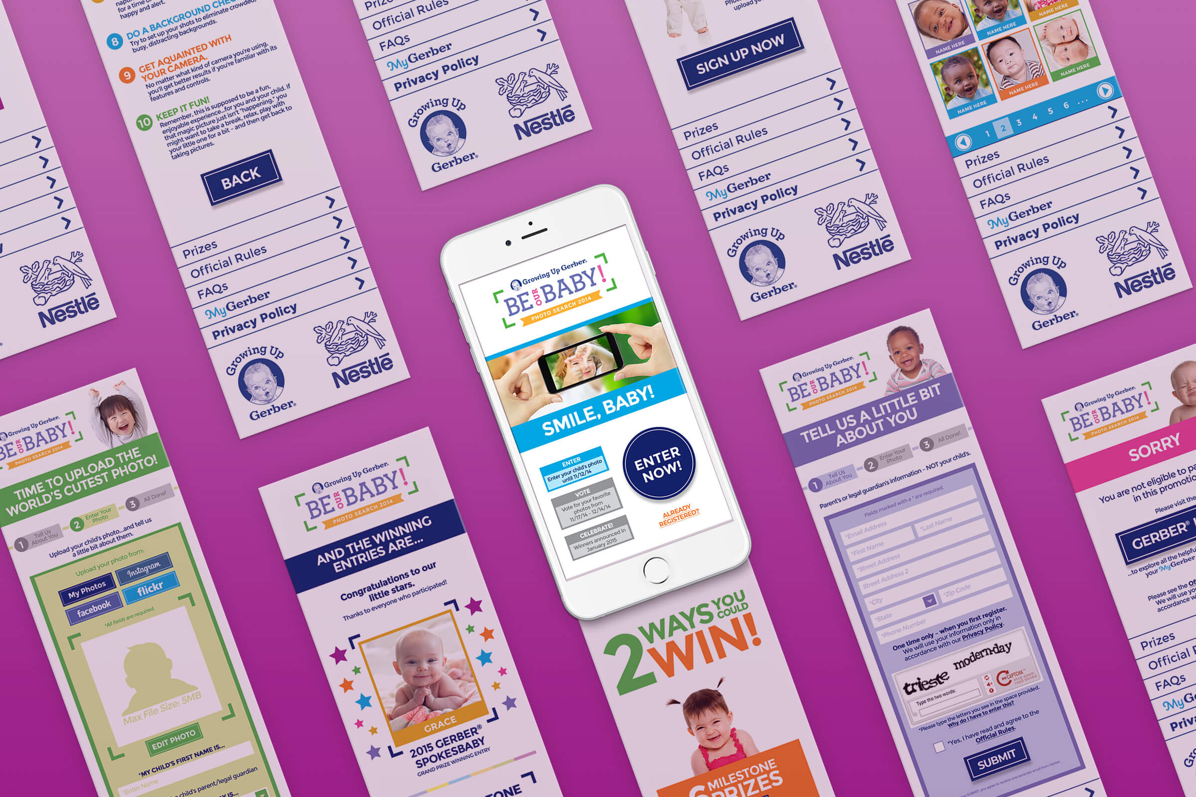
The Photo Search contest is a large promotion with multiple phases and many parts, from registration forms and photo upload interfaces to missing page and form errors. This provided a lot of insight as to everything that goes into designing a promotion of this size.
Gerber also wished to increase registrations for their free MyGerber support system, requiring participants to use a MyGerber login to enter. This complicated things as it required two separate registrations from two separate servers to work together. Presented with these complications and limitations, our copywriter Jon Hechtman and I sat down and devised a new entry process that integrated MyGerber registrations without sacrificing too much of the user experience.
For the user interface, I approached it from a mobile-first perspective (a relatively newer trend at the time) and integrated Gerber's Milestone color scheme throughout. We worked in tandem with a separate company to code the website. I purposely chose a simpler geometric layout that would be easier to code, as I knew inevitably some things would get lost in translation. I found my coding background to be very helpful throughout the process, making it easier to communicate with the developers and better understand their jargon and points of view.





You're Our Baby!
With a larger turnout from the prior year and an increase in MyGerber registrations, the promotion was considered a success. Grace Pfautz was named the new Gerber Baby that year, becoming part of a legacy that still continues today.
