Calming the Clutter
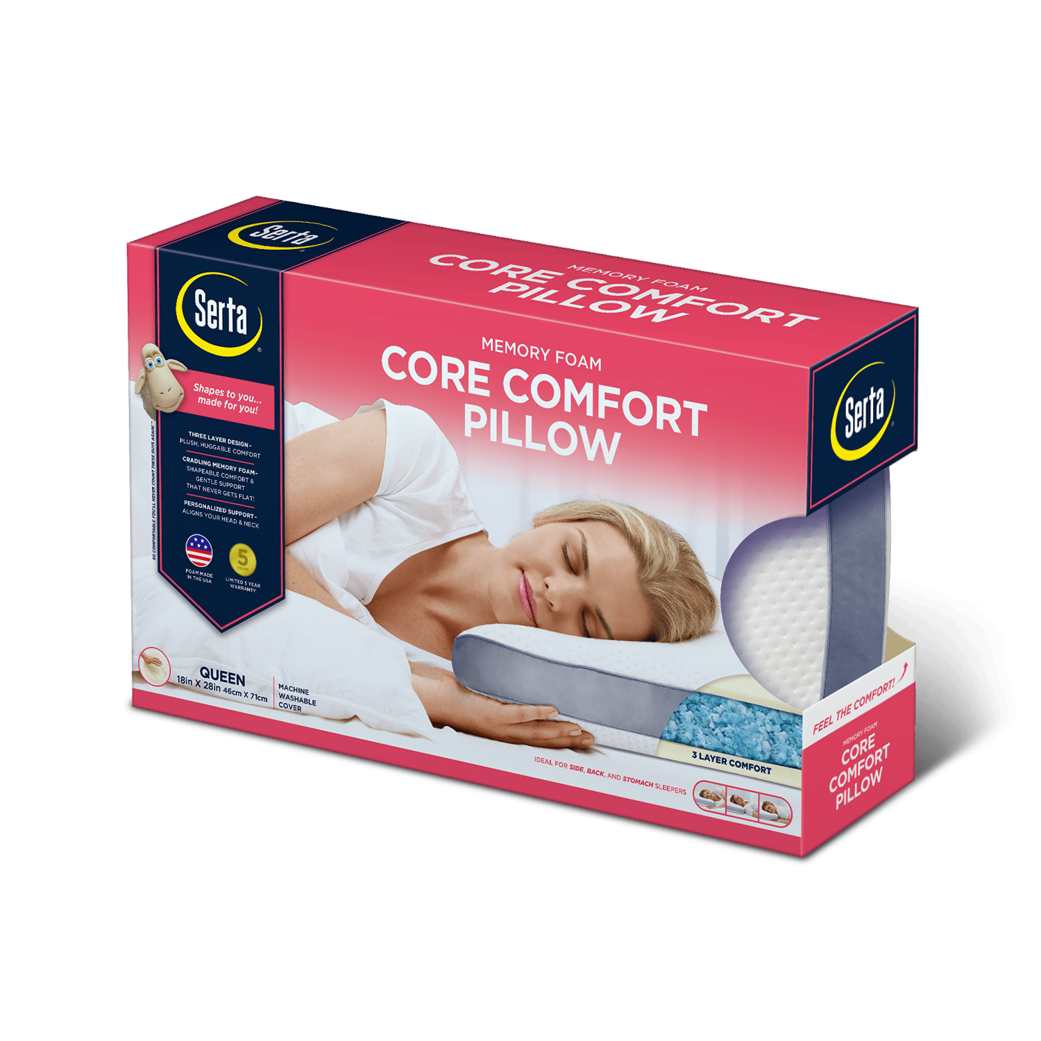
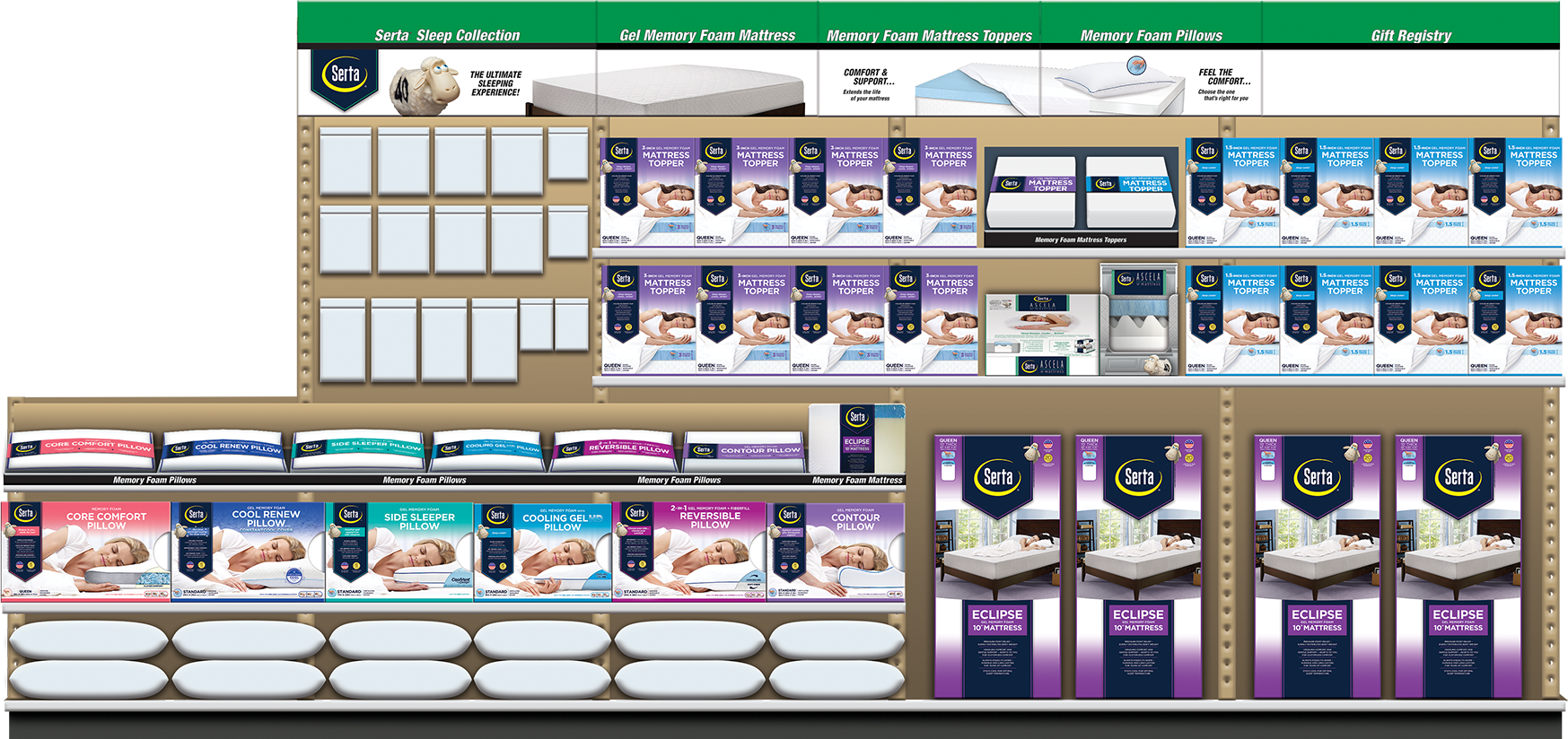
Innocor had been a client of ours for years, so I was no stranger to designing packaging for the bedding market. At this point their line of pillows and mattress toppers lacked a common visual language, each one having been designed at separate times by multiple designers.
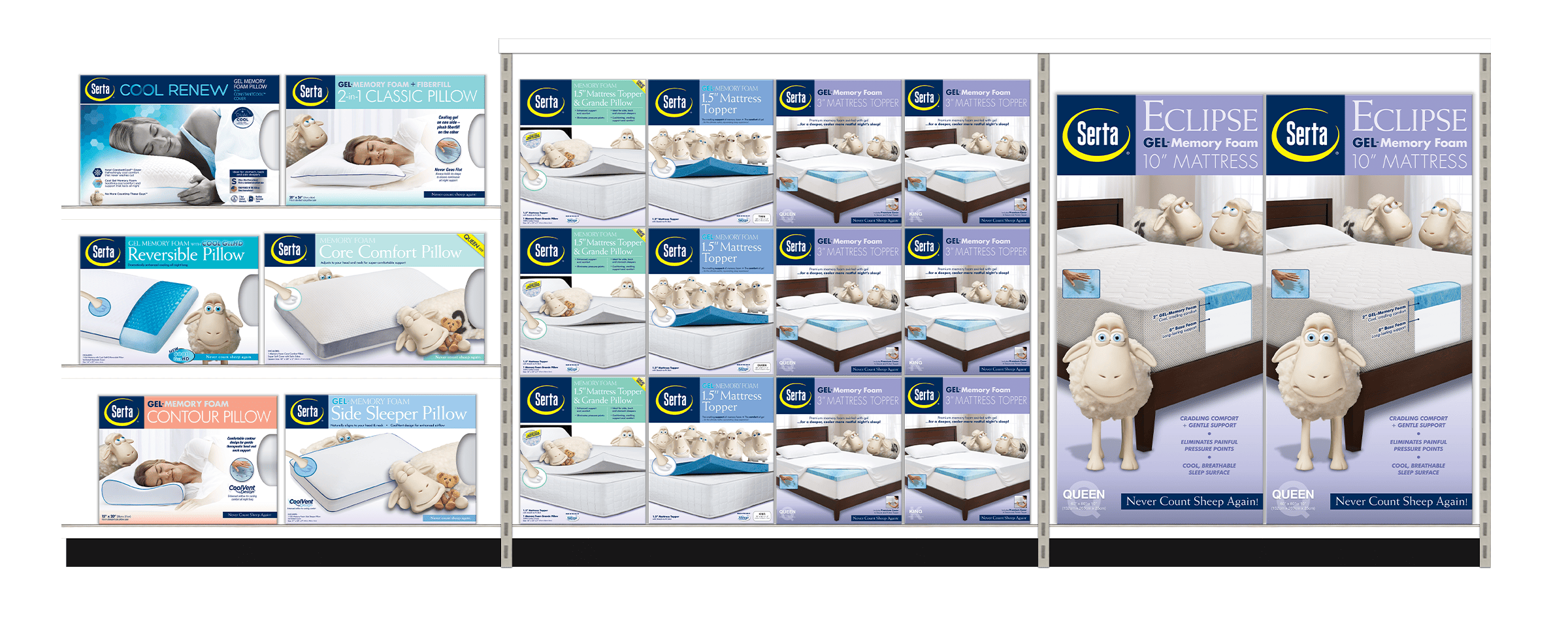
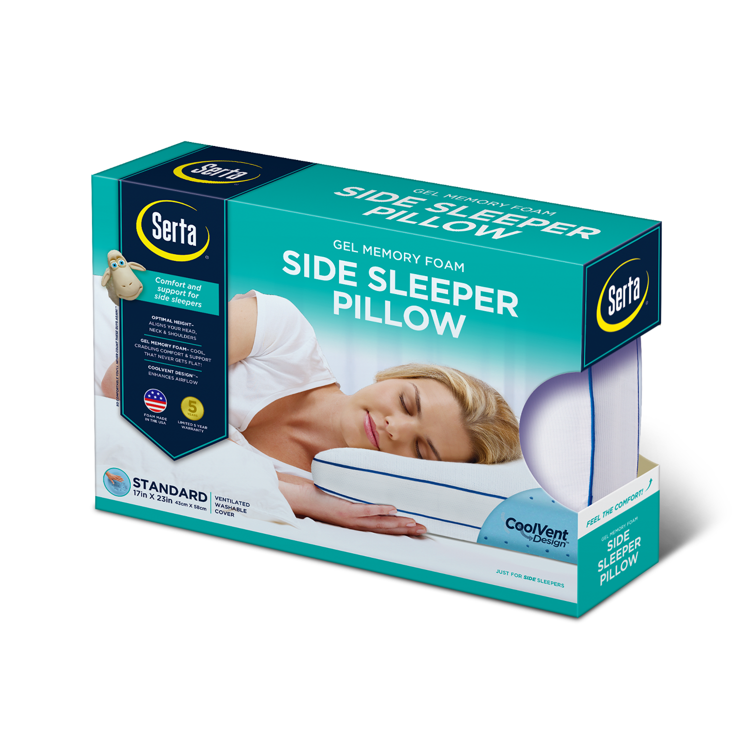
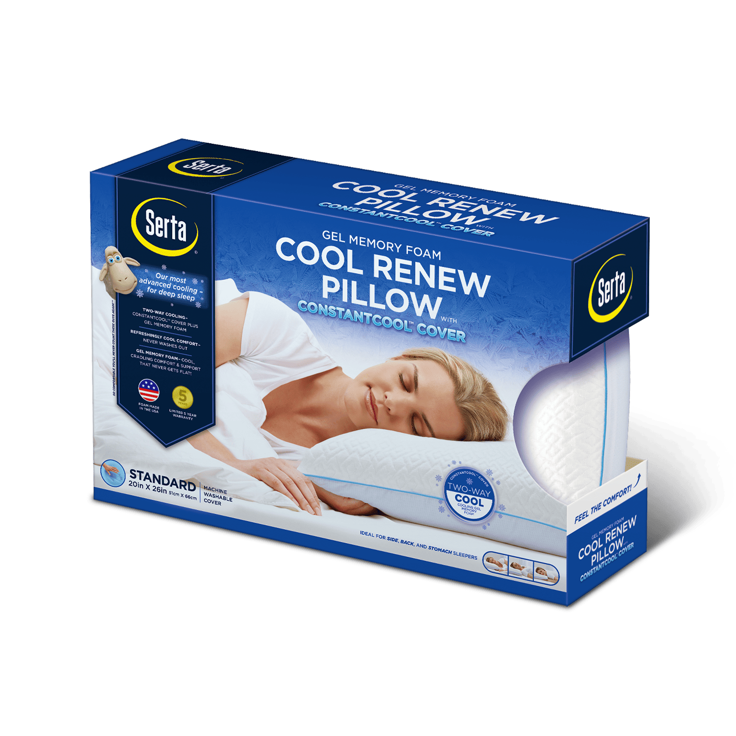
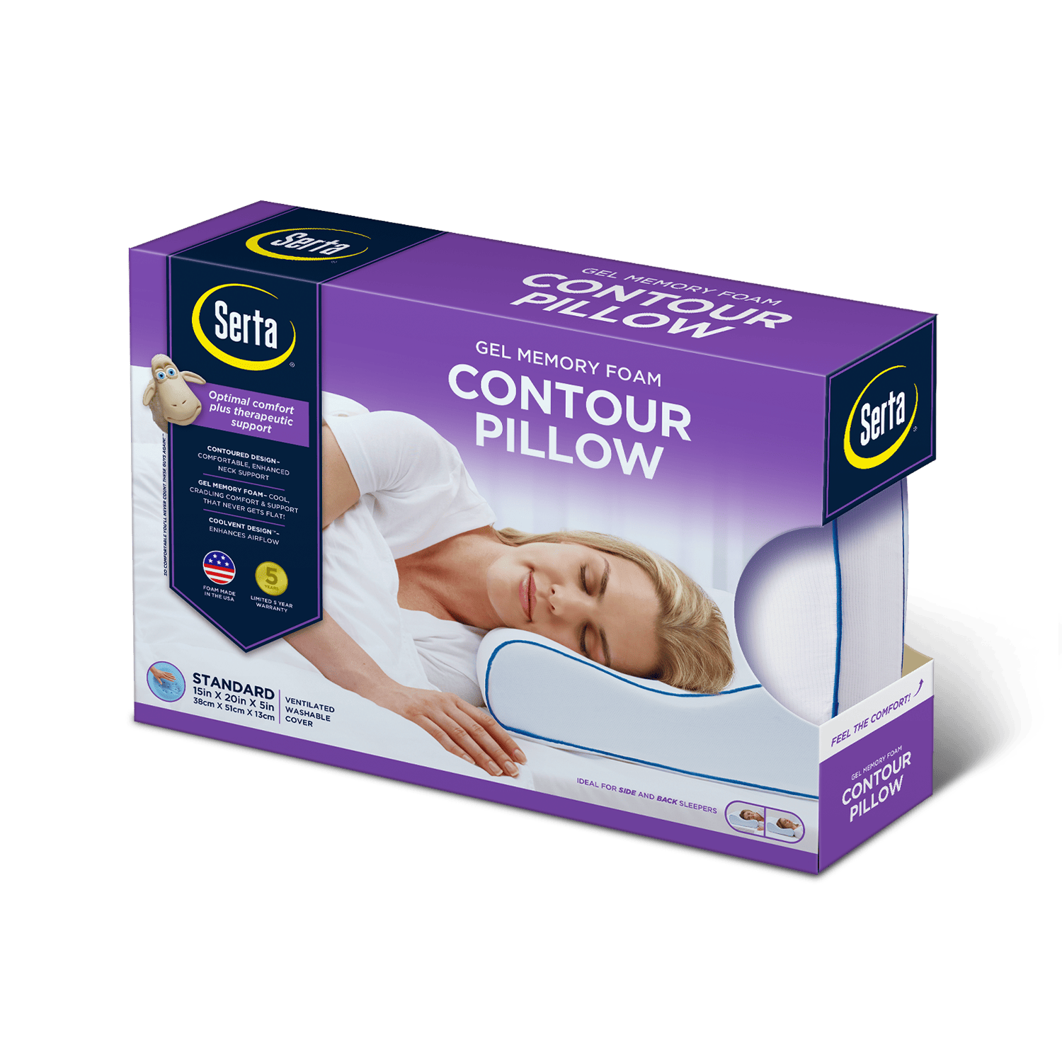
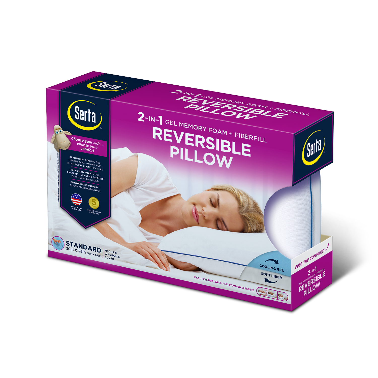
Another challenge was figuring out the best way to organize all of the information while still creating a tone of calm and serenity. By the time you add the logo, product name, unique features, warranty statement, sleep positions, memory foam indicator...you see where I'm going. The amount of information required can make the packaging feel overwhelming and cluttered.
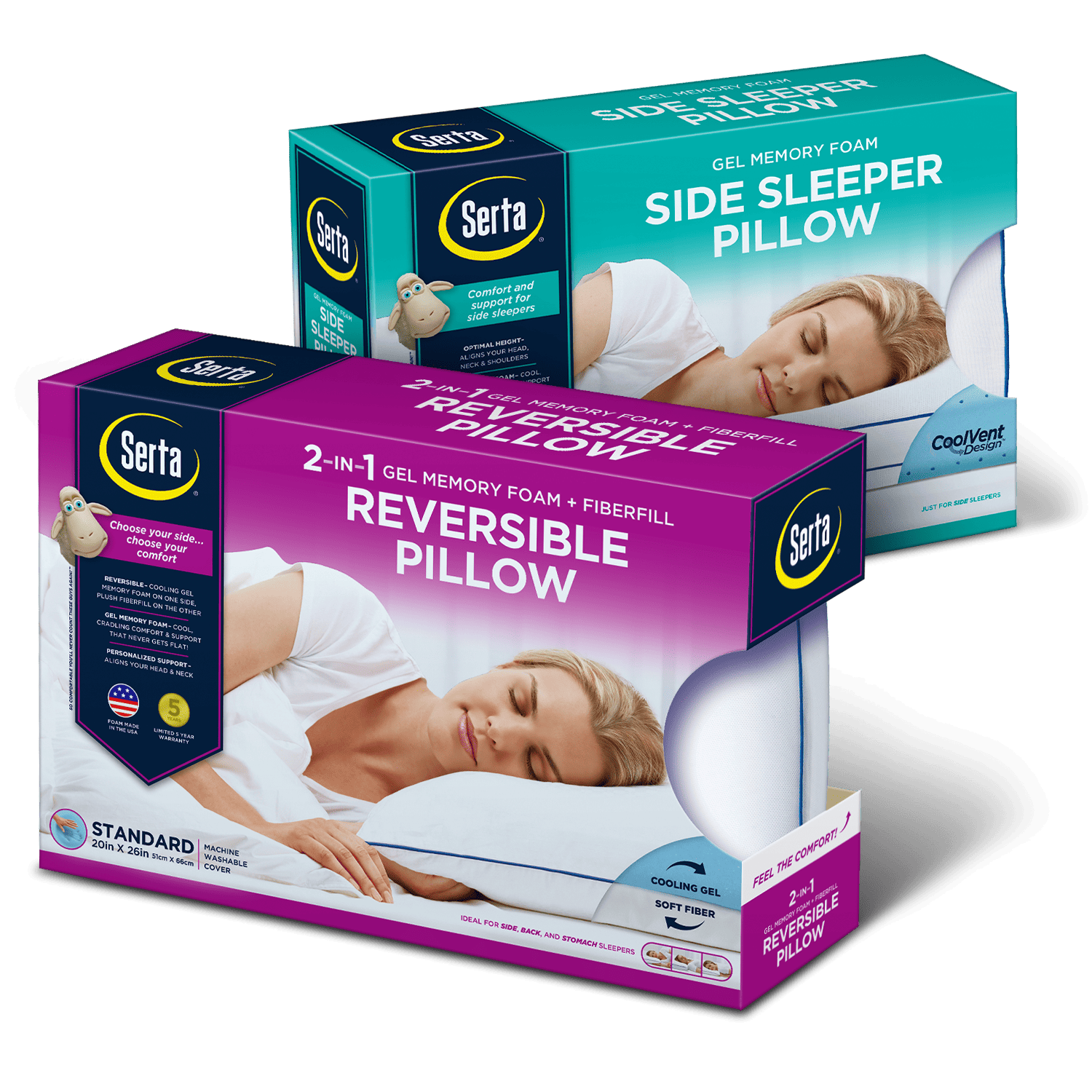
To solve this, I created a banner device to contain as much of the information as I could. Inspired by USPS Priority Mail packaging, I saw the banner as a symbol of legacy and trust. Having been around for almost a century, Serta has cemented itself as trustworthy brand in the bedding category.
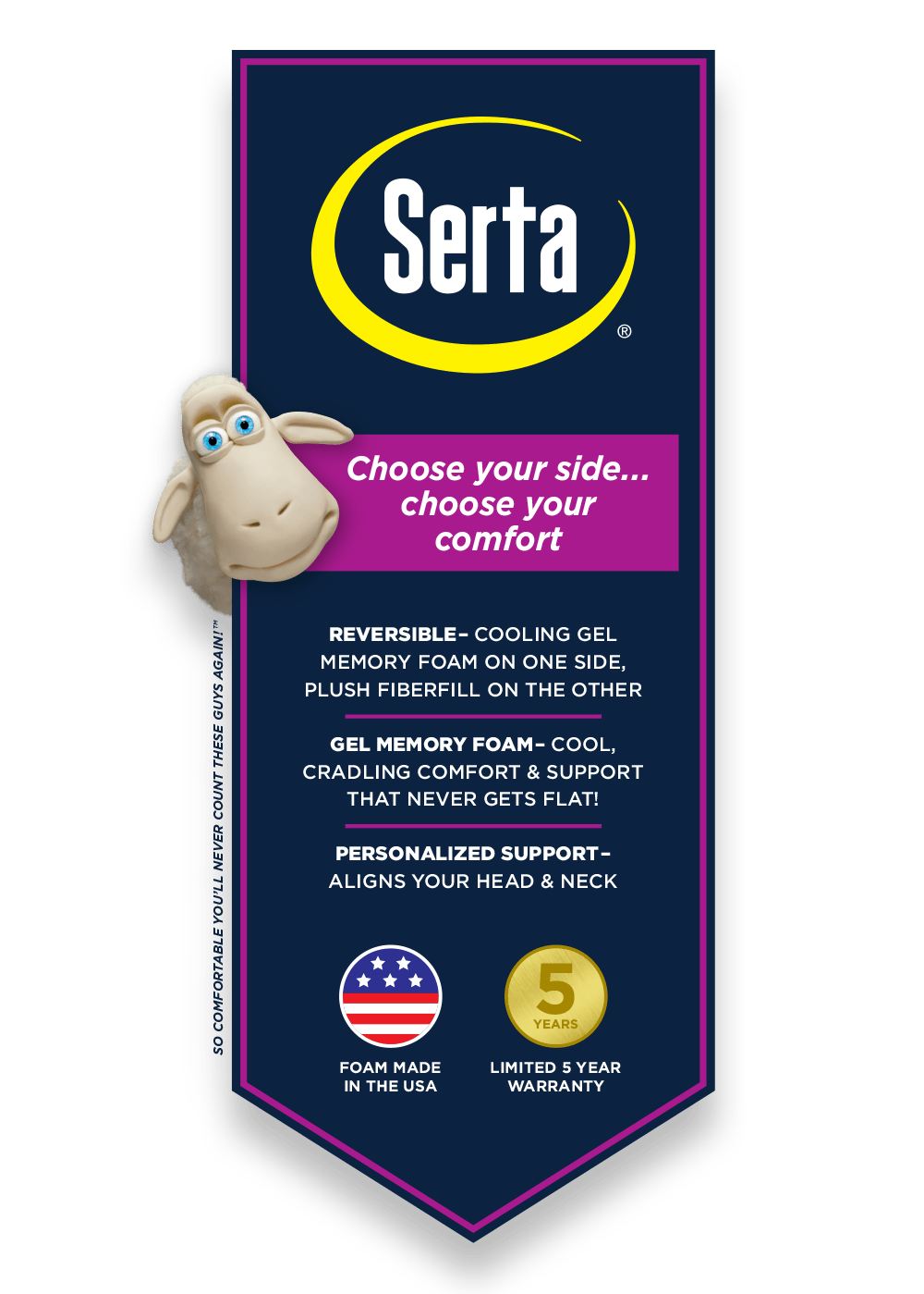
With a new branding device, bold colors, and a consistent architecture, I was able to create an eye-catching contemporary look and enhance the shelf presence of Serta's products.
