Creating the Logo
With plans to possibly offer instruction on more instruments in the future, Kale didn't necessarily need the logo to be guitar-focused. Starting with some sketches on my tablet, I focused on iconography that could relate both to academia and music. I picked three concepts from my sketches to further develop as vector art for the first round of client feedback:
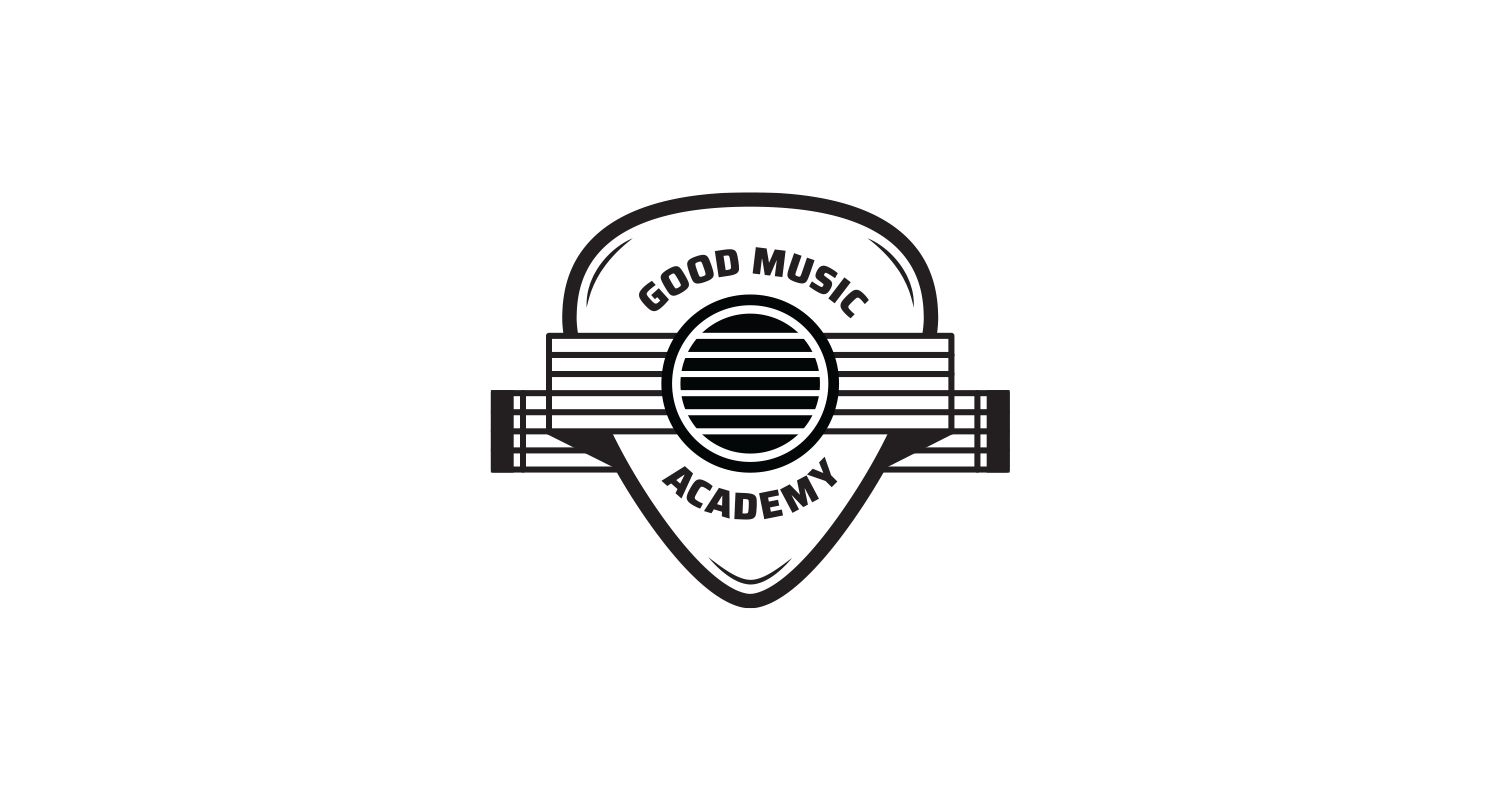
1. Pick Emblem
This concept uses the shape of a guitar pick to create a shield or emblem, a common device used in school and university logos.
2. Music Symbols
As someone who reads music, I realized many music symbols share similarities with the letters in the school's name. Together the music notes and letterforms create a logo that feels both classy and whimsical.

3. Greek Pillars
Kale expressed interest in a design that went the route of traditional academic architecture. I accomplished this by using a guitar bridge as the foundation and strings as the pillars.
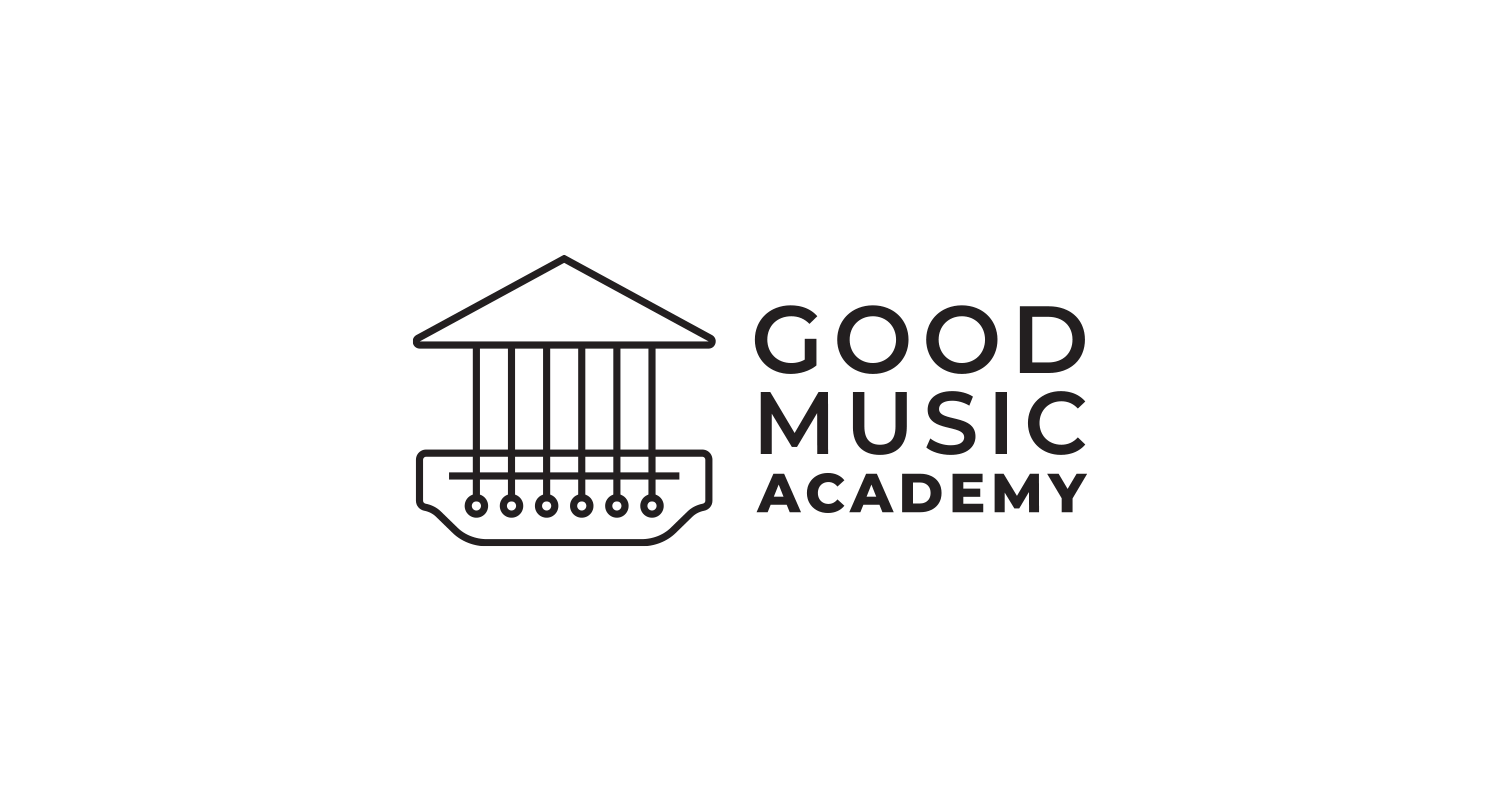
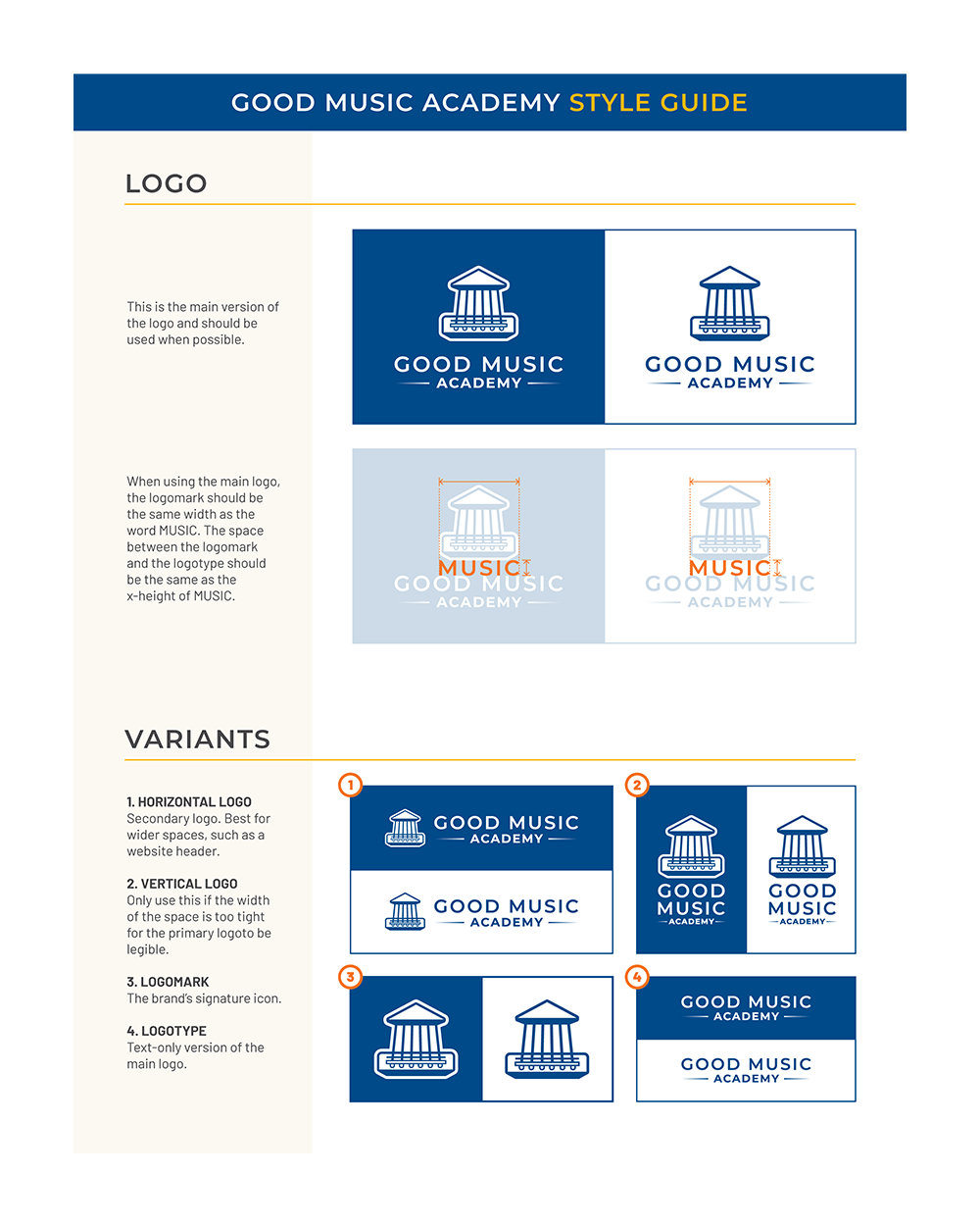
Kale ultimately chose to move forward with the Greek Pillar concept. After some discussion, we decided it felt a little sterile and needed some character. To address this, I tapered the columns inward (much like an actual guitar neck) to give it more perspective. The added dimensionality led to the final iteration of the logo:


Color Palette
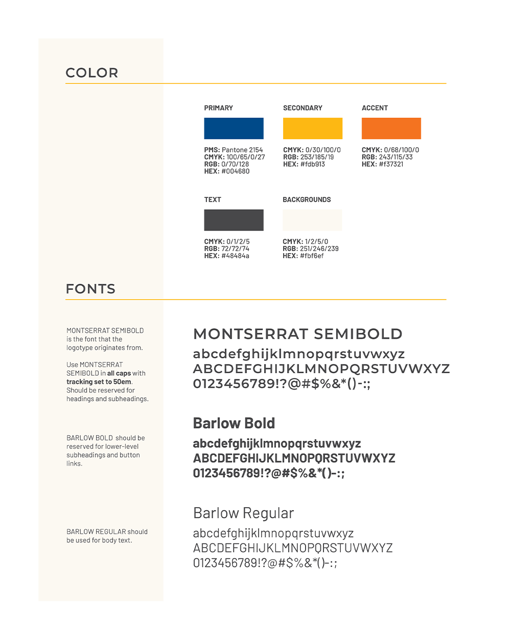
When deciding on a color palette, I started with the primary colors: red, blue, and yellow. Schools and universities will often use combinations of those three colors to represent their institutions. The primary colors are also seen in products geared toward children (think alphabet blocks). Not wanting to skew too juvenile, I chose orange as an accent color and went with a warmer yellow as the secondary color. Combined with Pantone's Classic Blue as the main brand color, these colors make up the new identity of Good Music Academy.
